I Created, Implemented and Maintained Design Systems at Singlife
When Singlife and Aviva joined forces, we found ourselves with a whole bunch of design libraries, each strutting its own stuff in terms of style and language. So, we put on our pruning hats and got down to business – redefining our design language, consolidate, recreate assets and components, and giving everything a fresh makeover to bring in those updates and enhancements.
Check out below to see how I rallied a crew of design wizards, all while juggling our regular tasks, to make this design system our one true source for all things design. 🌟🎨
My Role:
Lead Designer
Deliverables:
Design System for all applications.
Design Principles and Styleguide.
Configurable Components.
Guidelines and More
Outcomes:
Complete adoption across the entire team of 14 UXers.
Reduced designer ramp-up time by at least 20%.
3 fully published and functioning design libraries - Foundations, Components, Illustration.
Modular and scalable design components and more to enable consistent omnichannel experiences.
A design system website with In depth documentation for designers and developers.
🏦
Business impacted by inconsistent CX
The design teams at Singlife utilized multiple design libraries, each with its own set of design language, styling, and principles. This led to inconsistencies in the user experience across different applications. As a result, the interface design of our various web and app applications appeared, felt, and functioned differently from one another, leading to an overall inconsistent experience for the user.
🧙🏼
Design wizards confused
Designers faced confusion and frustration when it came to wireframe design, as they were uncertain of which libraries to use and how to utilize their components. Additionally, the naming conventions for text styles, colors, and components were inconsistent and arbitrary, making it difficult for them to find or search for specific elements.
🧑💻
Developers needed a consolidated library
While the developers were facing issues of their own with many applications running on different technologies and many component libraries, they also frequently question the existence of multiple similar-looking components that differ only by minimal pixel values. They also often wonder how UI components can be shared across different frameworks and libraries.
My
Design System
Strategy
Our objective is to establish a design direction rooted in our design principles and create the foundational elements for our building blocks. These will enable us to consistently produce high-quality interfaces through streamlined design and code processes.
Steps I Took
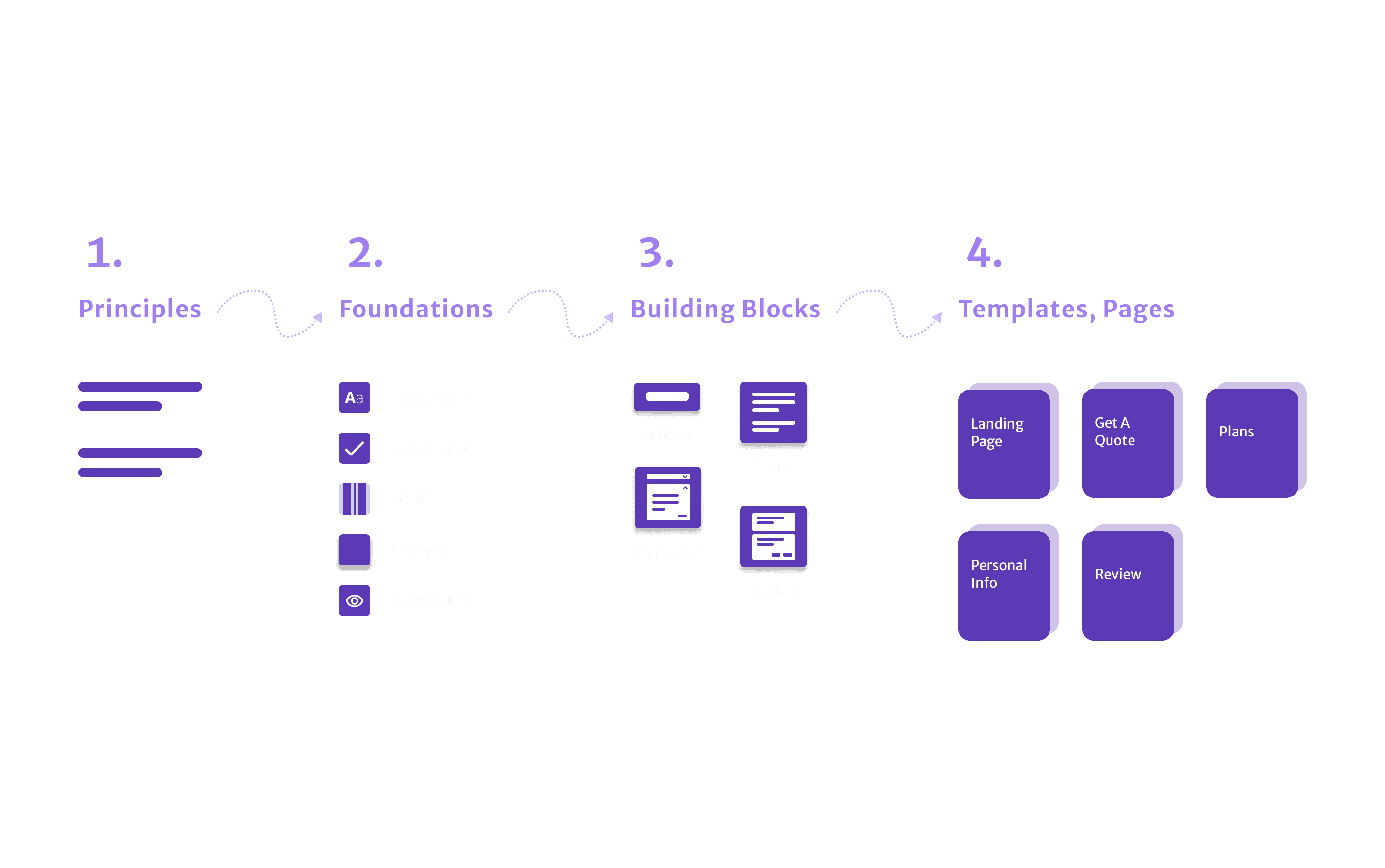
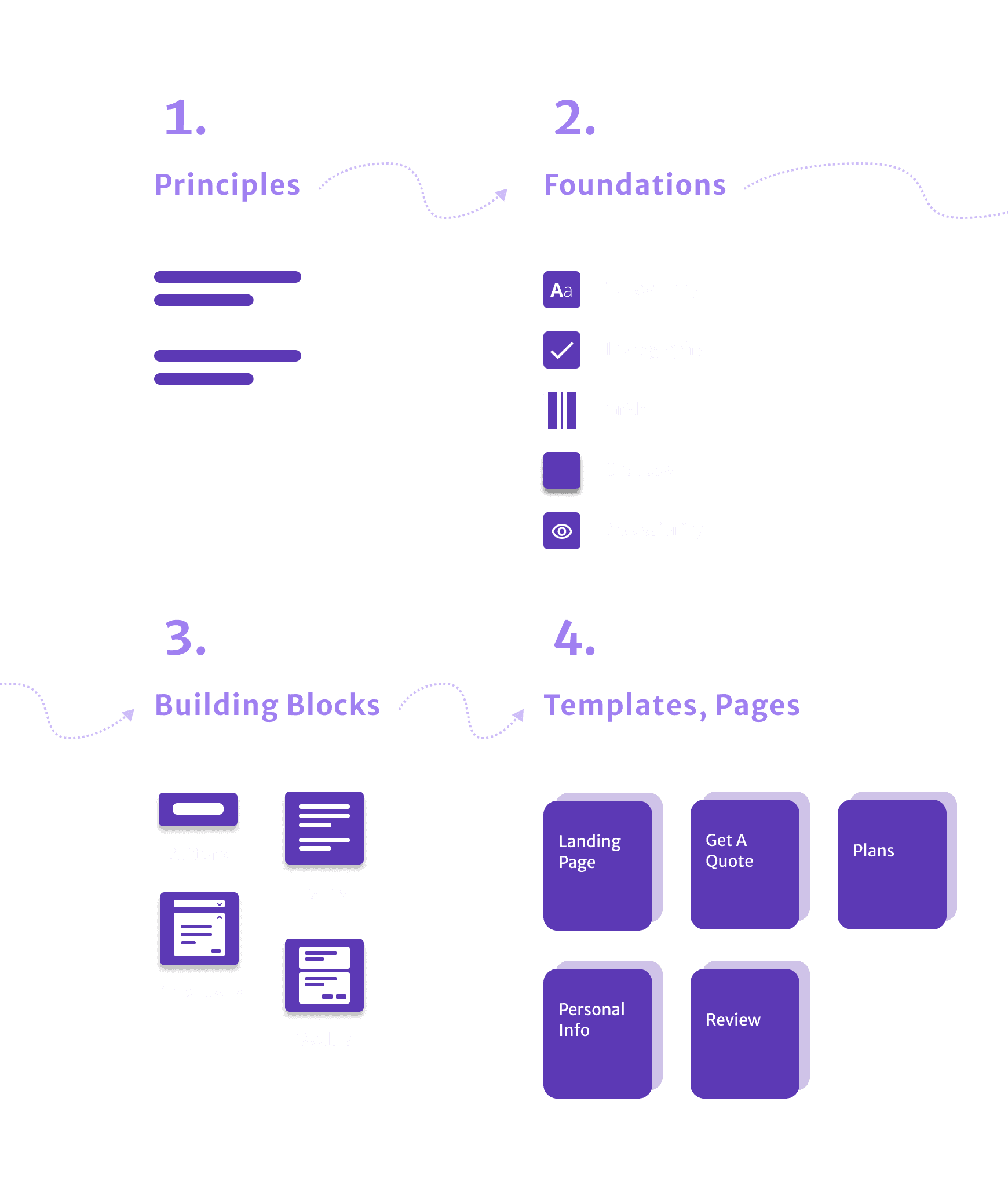
At-A-Glance
✨Design Principles as our guide and compass.
🎨Foundation elements like colors and fonts.
💎Components as building blocks.
💠Templates for speedy designs and launches.
📐Documentations like usage guidelines and a website for easy reference.
🔥Fireplace is a dedicated time and space for feedback and more.
✨
Design
Principles
Our design principles take inspiration from what matters most to our customers, the core values of our brand, and our team's design values. These principles not only steer our course but also imbue our design system with personality, forming the bedrock for all our creative pursuits. They serve as a universally understood guide for crafting new components.
🎨
Foundation
Elements

Our foundation comprises key design elements: Tone of Voice, Colors, Typography, Iconography, Illustrations, Grids, and Spacings. We took care that every color, typography and spacings surpassed WCAG AAA standards, and more recently APCA ratings of at least 60 for contrast.
💎
Component
Blocks
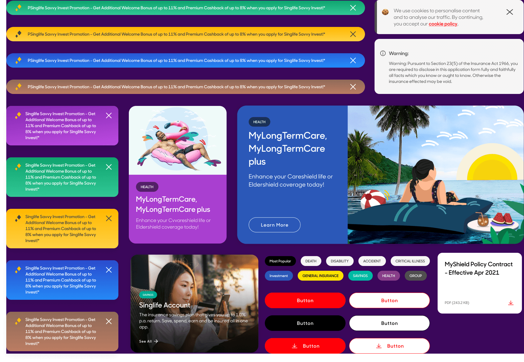
Our interface design is constructed using components as the fundamental building blocks. Each component type and version adheres faithfully to our core principles. Although designers have the flexibility to customize components for specific cases, certain attributes such as text styles, spacing, padding, and corners remain consistent.
Additionally, we provide templates, which are pre-designed pages containing sets of nested components. These templates serve to enhance design uniformity and minimize errors. We offer two types:
Template pages encompass both general and journey-specific screens, complete with preset paddings, spacings, and components for their intended purpose.
Component groupings assemble various components, making them valuable for new applications or concept exploration. For example, you'll find a set of input fields for forms or a variety of card sizes with commonly used components.
📐
Guides &
Documentations
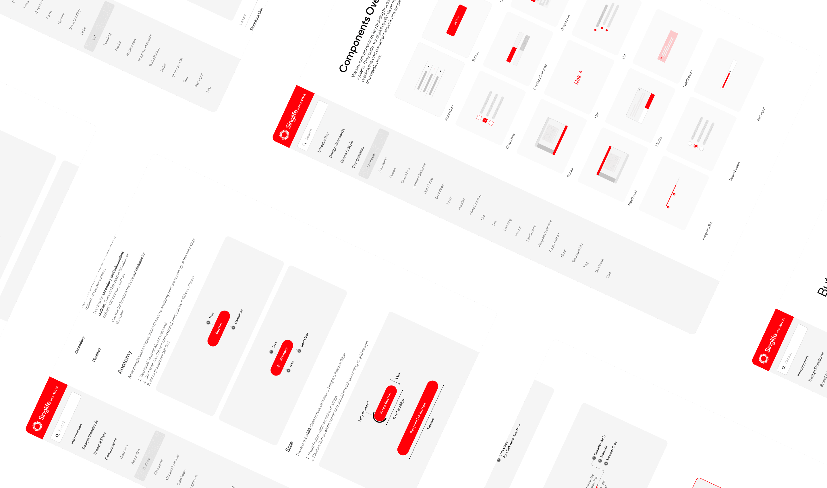
Every component page has detailed guides explaining its structure, style, and usage. These guides are part of the library as components themselves, making it super easy for designers to find and refer to them.
We also cooked up an in-house website for documentation, acting as a point of reference for designers, developers, and others. It's a one-stop shop for all the deets on our components, with text, images, and even live demos showing how each component rocks.
And if developers need a hand, they've got quick links to different Storybooks (React and Angular) and guides for code.
🔥
Fireplace

I started Fireplace, a cool bi-weekly gathering between designers for all things Design System. In these chats, we dive into stuff like where the Design System is at, adding new pieces, jazzing up design libraries, and more.
With time, Fireplace has become a sweet hangout where designers and others can soak up lessons from real-life cases and build that cozy community vibe.
🌟🌟🌟
⭐ 100% adoption rate across team of 14 UX designers - This means that every member of the team has fully embraced and integrated the design system into their workflow.
⭐ UI Design and Prototype ramp-up time reduced by at least 20%. This means that designers can deliver design solutions faster - quickly whip up very polished screens and prototype for testing or to facilitate discussions.
⭐ From 10 to just 3 design libraries with scalable components. The 3 design libraries are Foundations, Components (Main) and Illustrations. Our components are also designed and setup to be modular and adaptable to cater to a wide range of identified use cases and beyond.
⭐ A consistent omnichannel experience. This means that each and every one of Singlife's digital products will feature a consistent design, guaranteeing a cohesive user experience across all initiatives.
⭐ A Consolidated Storybook (Using React) for Developers. This storybook serves as a comprehensive reference for developers and streamlines the development process, reduces errors, and ensures that the final product closely aligns with the design system's specifications.
